
< Previous lab day | Module 2 lab index
Introduction
This is it, folks! The moment of truth. Time to find out how the proteins that you worked so hard to make, purify, and test really behave. Although you should be able to produce reasonable titration curves by following the example of Nagai, the introduction/review of binding constants below may help contextualize your analysis.
Let's start by considering the simple case of a receptor-ligand pair that are exclusive to each other, and in which the receptor is monovalent. The ligand (L) and receptor (R) form a complex (C), which reaction can be written.
![]()
At equilibrium, the rates of the forward reaction (rate constant = kf) and reverse reaction (rate constant = kr) must be equivalent. Solving this equivalence yields an equilibrium dissociation constant KD, which may be defined either as kr / kf, or as [R][L] / [C], where brackets indicate the molar concentration of a species. Meanwhile, the fraction of receptors that are bound to ligand at equilibrium, often called y or θ, is C / RTOT, where RTOT indicates total (both bound and unbound) receptors. Note that the position of the equilibrium (i.e., y) depends on the starting concentrations of the reactants; however, KD is always the same value. The total number of receptors RTOT= [C] (ligand-bound receptors) + [R] (unbound receptors). Thus,
![]()
where the right-hand equation was derived by algebraic substitution. If the ligand concentration is in excess of that of the receptor, [L] may be approximated as a constant, L, for any given equilibrium. Let's explore the implications of this result:
- What happens when L << KD?
→Then y ~ L / KD, and the binding fraction increases in a first-order fashion, directly proportional to L.
- What happens when L >> KD?
→In this case y ~1, so the binding fraction becomes approximately constant, and the receptors are saturated.
- What happens when L = KD?
→Then y = 0.5, and the fraction of receptors that are bound to ligand is 50%. This is why you can read KD directly off of the plots in Nagai's paper (compare Figure 3 and Table 1). When y = 0.5, the concentration of free calcium (our [L]) is equal to KD. This is a great rule of thumb to know.
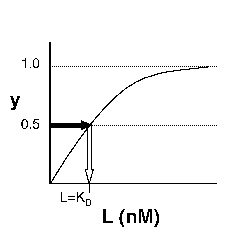
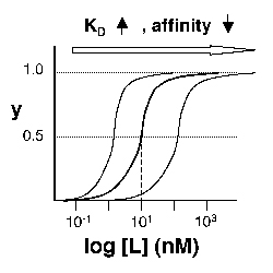
Left: Simple Binding Curve. The binding fraction y at first increases linearly as the starting ligand concentration is increased, then asymptotically approaches full saturation (y=1). The dissociation constant KD is equal to the ligand concentration [L] for which y = 1/2. Right: Semilog Binding Curves. By converting ligand concentrations to logspace, the dissociation constants are readily determined from the sigmoidal curves' inflection points. The three curves each represent different ligand species. The middle curve has a KD close to 10 nM, while the right-hand curve has a higher KD and therefore lower affinity between ligand and receptor (vice-versa for the left-hand curve).
The above figures demonstrate how to read KD from binding curves. You will find semilog plots (right) particularly useful today, but the linear plot (left) can be a helpful visualization as well. Keep in mind that every L value is associated with a particular equilibrium value of y, while the curve as a whole gives information on the global equilibrium constant KD.
Of course, inverse pericam has multiple binding sites, and thus IPC-calcium binding is actually more complicated than in the example above. The KD reported by Nagai is called an 'apparent KD' because it reflects the overall avidity of multiple calcium binding sites, not their individual affinities for calcium. Normally, calmodulin has a low affinity (N-terminus) and a high affinity (C-terminus) pair of calcium binding sites. However, the E104Q mutant, which is the version of CaM used in inverse pericam, displays low-affinity binding at both termini. Moreover, the Hill coefficient, which quantifies cooperativity of binding in the case of multiple sites, is reported to be 1.0 for inverse pericam. This indicates that inverse pericam behaves as if it were binding only a single calcium ion per molecule. Thus, wild-type IPC is well-described by a single apparent KD.
When you write your research article, be sure to consider how changes in both binding affinity and cooperativity can affect the practical utility of a sensor.
Protocols
Part 1: Titration Curve in Excel and First Estimate of KD
Today you will analyze the fluorescence data that you got last time. Begin by analyzing the wild-type protein as a check on your work (your curve should resemble Nagai's Figure 3L), then move on to your mutant samples. If you are not familiar with manipulations in Excel, use the Help menu or ask the teaching faculty for assistance.
- Open an Excel file for your data analysis. Begin by making a column of the free calcium concentrations present in your twelve test solutions. Assuming a 1:1 dilution of protein with calcium, the concentrations are: 10 nM, 50 nM, 100 nM, 200 nM, 400 nM, 500 nM, 600 nM, 800 nM, 1 μM, 2.5 μM, 10 μM, 100 μM. Be sure to convert all concentrations to the same units.
- Now open the text file containing your raw data as a tab-delimited file in Excel.
- Samples of calcium titration data for four student lab groups; includes one optional repeat (T/R Blue group) after 24 hour settling period (ZIP).
- Convert the row-wise data to column-wise data (using Paste Special → Transpose), and transfer each column to your analysis file. Add column headers to indicate which protein is which, and analyze each replicate separately for now. Also include a column of your control samples that did not contain protein.
- Begin by calculating the average of your blank samples, and bold this number for easy reference. It is the background fluorescence present in the calcium solutions and should be quite low. If necessary, subtract this background value from each of your raw data values. It may help to have a 6-column series called "RAW", and another called "SUBTRACTED."
- Next you should normalize your data. The maximum and minimum fluorescence values for a given titration series should be defined as 100% and 0% fluorescence, respectively, and every other fluorescence value should be expressed as a percentage in between. Think about how to mathematically express these conditions.
- First calculate the percent fluorescence for both replicates. Then make a new column and calculate the average percentage as well. Alternatively, average your data first, and then normalize the average data.
- If one data point seems really off from the other replicate and from the expected trend, you might consider it an outlier and delete it, especially if you have good reason to believe that there was a reason (error in pipetting, air bubble in that well) for the anomaly. Otherwise, you might be losing valuable information, and/or misleading anyone who tries to interpret your data.
- For each protein, plot this normalized data versus calcium concentration. Save these plots in case you want to include them in your report.
- You might plot the two replicates as points and their average value as a dashed line (see front page of this module).
- Note down the approximate inflection points of the curves, which should occur at half-saturation: these indicate the approximate values of the apparent KD for each sample.
Part 2: Improved Estimate of KD Using MATLAB® Modeling
Preparation
- Download these MATLAB files (ZIP) (This ZIP file contains: 3 .m files.). Move them to the username/Documents/MATLAB folder on your PC.
- Double-click on the MATLAB icon to start up this software.
- The main window that opens is called the command window: here is where you run programs (or directly input commands) and view outputs. You can also see and access the command history, workspace, and current directory windows, but you likely won't need to today.
- In the command window, type more on; this command allows you to scroll through multi-page output (using the spacebar), such as help files.
- In addition to the command area, MATLAB comes with an editor. Click File → Open and select the program S10_Fit_Main. It has the .m extension and thus is executable by MATLAB. Read the introductory comments (the beginning of a comment is indicated by a % sign), and then input your fluorescence data.
- Read through the program, and as you encounter unfamiliar terms, return to the workspace and type help functioname. Feel free to ask questions of the teaching faculty as well.
- You might read about such built-in functions as logspace and nlinfit.
- You will also want to open and read Fit_SingleKD – a user-defined function called by S10_Fit_Main – in the MATLAB editor.
- If you type help function you will learn the syntax for a function header.
- Note that a dot preceding an operator (such as A ./ B or A .* B) is a way of telling MATLAB to perform element-by-element rather than matrix algebra.
- Also note that when a line of code is not followed by a semi-colon, the value(s) resulting from the operation will be displayed in the command window.
Analysis
- Once you more-or-less follow Part 1 of the program, type S10_Fit_Main in the workspace, hit return to run the program, and address the following questions in your notebook:
- Why must the fluorescence data be transformed (from S to Y) prior to use in the model?
- What KD values are output in the command window, and how do they compare to the values you estimated from your Excel plots?
- Figure 1 should display your wild type and mutant data points and model curves. How do they look in comparison to the curves you plotted in Excel?
- Figure 2 should display the residuals (difference between data and model) for your three proteins. If the absolute values are low, this indicates good agreement between the model and the data numerically. Whether or not this is the case, another thing to look for is whether the residuals are evenly and randomly distributed about the zero-line. If there is a pattern to the errors, likely there is a systematic difference between the data and the model, and thus the model does not reflect the actual binding process well. What are the residuals like for each of your modeled proteins?
- Now move on to Part 2 of the S10_Fit_Main program. Part 2 also fits the data to a model with a single, 'apparent' value of KD, but it allows for multiple binding sites and tests for cooperativity among them. The parameter used to measure cooperativity is called the Hill coefficient. A Hill coefficient of 1 indicates independent binding sites, while greater or lesser values reflect positive or negative cooperativity, respectively. Again, address the following in your notebook:
- Visually, which model appears to fit your wild-type data better (Fig. 3 vs. Fig. 1)? Your mutant data?
- Do the respective residuals support your qualitative assessment (Fig. 4 vs. Fig. 2)?
- Numerically, how do the values of KD compare for the two models? How does the value of n compare to the implicitly assumed value in Part 1?
- Do you see changes in binding affinity and/or cooperativity between the wild-type, M124S, and X#Z samples? Do they match your a priori predictions?
- Don't forget to save any figures you want to use in your report! If the legends are covering up your data, you can simply move them over with your mouse.
- Finally, you can skim Part 3 of the S10_Fit_Main program. Don't worry too much about the coding details, but do read through the comments.
- Look at Part 1 of Figure 5: are the binding curves asymptotic, sigmoidal, or other? What does this shape indicate? You can use the zoom button to get a closer look at part of the plot, or the axis command present in the code. (Don't worry too much about this question if it is unclear.)
- Now look in the command window. What values of KD and Hill coefficient (n) do you get for your three proteins? How do the KD's from Part 3 compare to the ones from Parts 1 and 2? Don't be discouraged if your wild-type values do not exactly match Nagai's work, or if there is variation between Parts 1, 2, and 3.
- Comparing the model and data points by eye (Part 2 of Figure 5), do you think it is a good model for any of your proteins? If so, which ones? What experimental limitations might prevent Hill analysis working well for anyone's samples today?
- Why should only the transition region be analyzed in a Hill plot?
- What is the relationship between slope and KD and/or n, and intercept and KD and/or n?
- If your mutant proteins are not well-described by any of the models so far, what kind of model(s) (qualitatively speaking) do you think might be useful?
- Optional: If your data might be well-described by a model with two KD's (or if you are interesting in exploring some sample data that is), download and run these two MATLAB files (ZIP) (This ZIP file contains: 2 .m files.)
Following are the analysis results from the four lab groups for whom raw titration data data was supplied above.
| GroupS | X#Z MutantS | Most believable KD; n for WT | Most believable KD; n for M124S | Most believable KD; n for X#Z mutant | Comments |
|---|---|---|---|---|---|
| T/R Blue | D129P | 0.4431; 8.3 | 0.9535; 2.1 | 0.8092; 3.5 | We chose the second model because the results correlated almost exactly with our predicted Excel data, factored in the cooperativity of CaM, and the absolute values of the residuals were closest to zero. The Hill coefficient shouldn't exceed 4…so we're looking into that. |
| T/R Green | G23P | 0.4606, 12.1895 | 0.3347, 0.8646 | 0.7678, 3.9190 | For our M124S data, our average curve looked pretty awful, so we just took the normalized data of one of our data sets. We chose the part 2 model, which had Kd values close to those of the excel spreadsheet, accounted for cooperativity, and incorporated more data points. |
| T/R Orange | G25P | KD=.4484 n=9.3825 | KD=.9536 n=2.1191 | KD=.5555 n=-.3638 | We used model 2. It fit the control and M124S best. It was okay for G25P, but didn't perfectly match. However, there was little overall change in fluorescence and none of the other models fit well. |
| W/F Red | E84K | 0.44; 11.23 | 0.86; 2.30 | 0.55; 16.63 | We used the model 2 data, since it have smaller residual values, and it best match out predicted data from excel, compared to model 1. Model 3 results are not too ideal because they yield too much error (little data sets in the transition region). We eliminated the first 4 values of 1 replicate of M124S because we believe there is pipetting error. |
For Next Time
- The first draft of your research article is due by 11 a.m. on your next lab day.
- Your second self-assessment (PDF) is due in lab on Day 1 of Module 3.
- Shortly before class next time, you should read the 20.109 Guidelines for working in the tissue culture facility. We will have also a presentation from MIT's Environmental Health and Safety Office to help prepare you for doing cell cultures next week.